Skip to content
Menu
Projects
Featured
Commercial
Residential
In Progress
Craft
Office
About
People
Studio
Contact
(210) 735-9722
info@donbmcdonaldarchitect.com
2121 N Main Ave
San Antonio, TX 78212
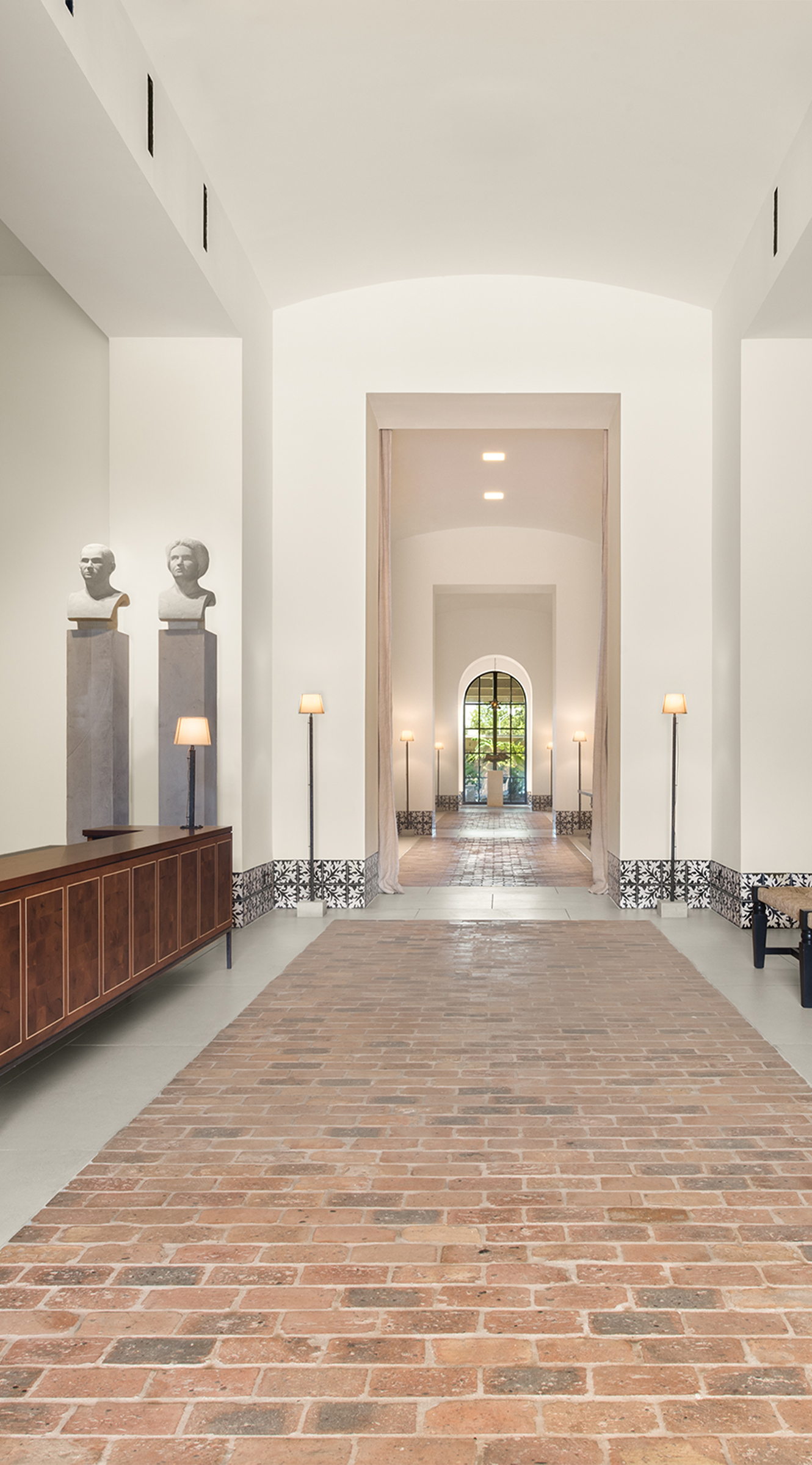
Cellars
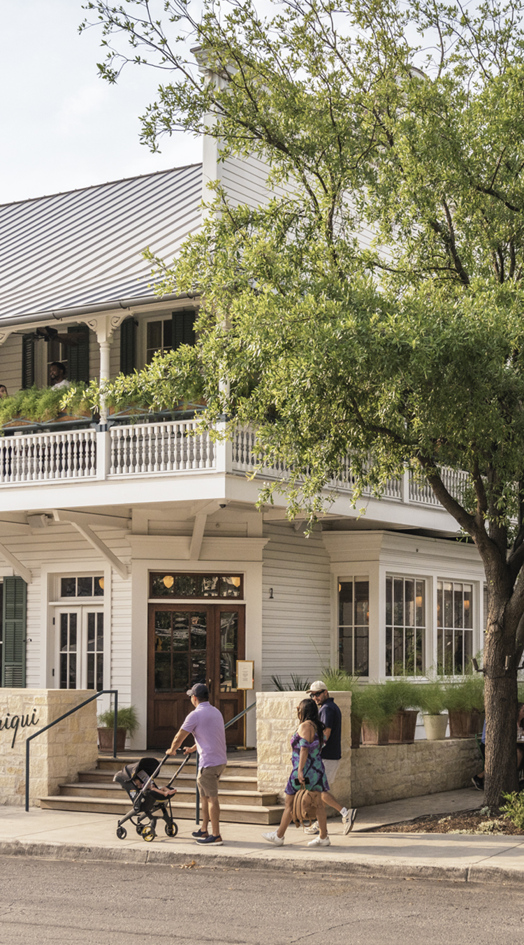
Carriqui
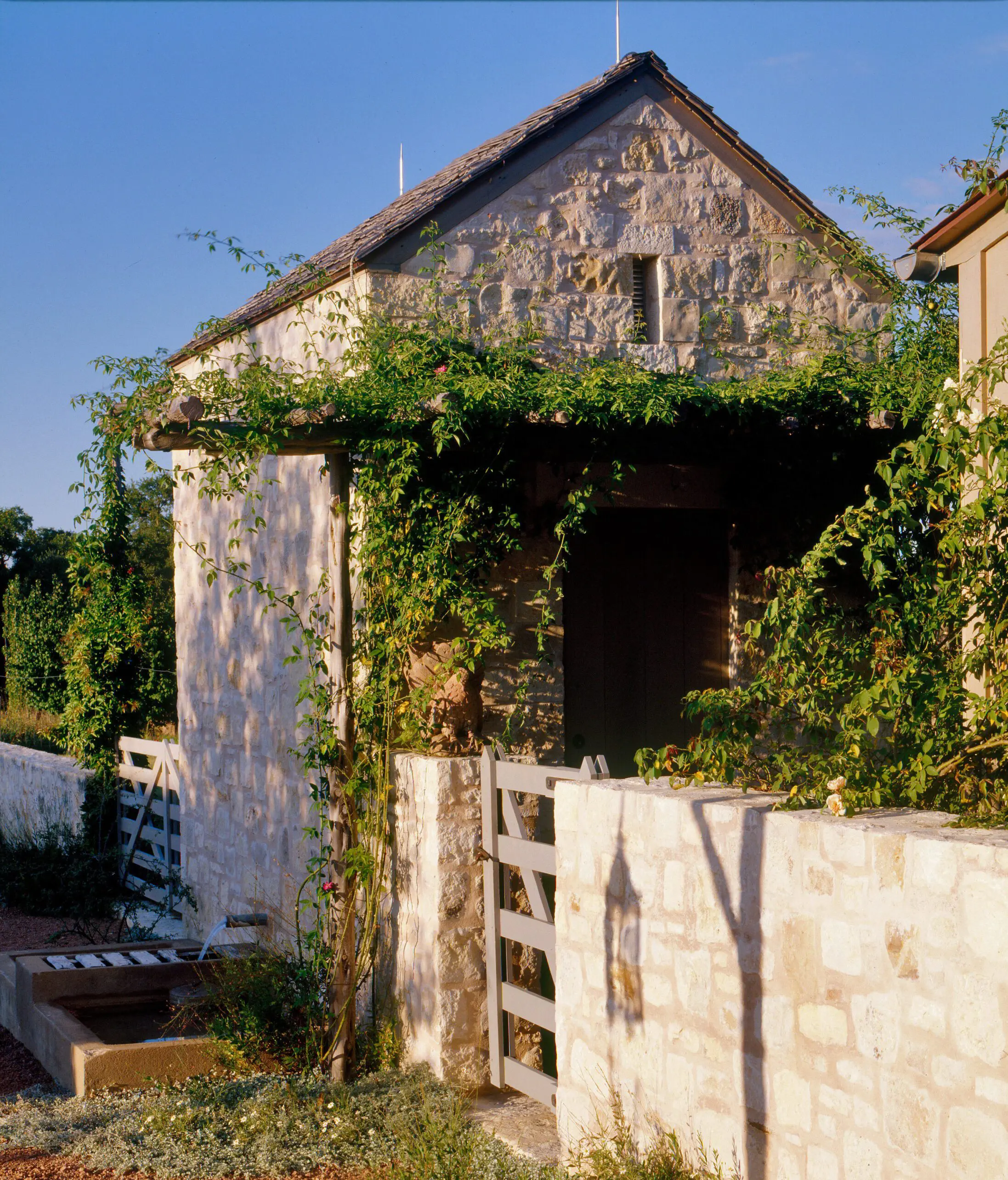
Boot Ranch
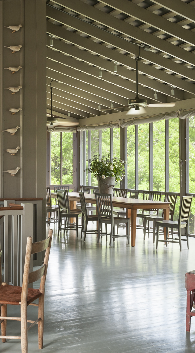
Triple Creek Ranch
Casa Susana
Credit Human
Argyle
Harvey Ranch